Responsive Design
Your app needs to look good on every screen size. Webtwizz lets you preview different devices and adjust styles per breakpoint using Tailwind CSS classes.
Device Preview
Click the device toggle in the toolbar to pick a screen size. This changes the canvas width so you can see how your app looks on that device.
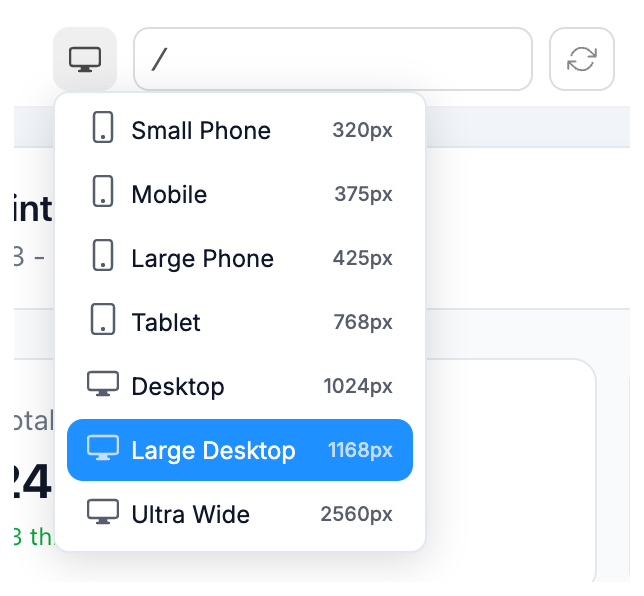
| Device | Width |
|---|---|
| Small Phone | 320px |
| Mobile | 375px |
| Large Phone | 425px |
| Tablet | 768px |
| Desktop | 1024px |
| Large Desktop | 1168px |
| Ultra Wide | 2560px |
Switching the preview does not change any styles. It only resizes the canvas so you can check how things look.
Making Styles Responsive
To apply a style only at a certain screen size, use the Advanced section in the edit panel. This is where you add Tailwind CSS classes with breakpoint prefixes.
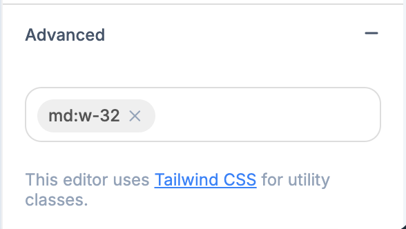
For example, md:w-32 sets the width to 32 units on medium screens and up. Common prefixes:
| Prefix | Applies at |
|---|---|
sm: | 640px and up |
md: | 768px and up |
lg: | 1024px and up |
xl: | 1280px and up |
Type the class into the Advanced field and press Enter. Switch device views to verify the result.
Hiding Elements on Certain Devices
Add hidden to hide an element by default, then add a breakpoint class to show it at that size. For example:
hidden md:block- hidden on phones, visible on tablets and upmd:hidden- visible on phones, hidden on tablets and up